The title is a joke. Graphic design is not my passion. Graphic design is my enemy. I am beyond envious of the people who can seamlessly put together cute slides for classes or curate the perfect collage for their Instagram story. Somehow, no matter how hard I try, I feel clumsy in Canva. I can’t keep things concise with graphics to show my points. I yearn to yap. Every attempt I’ve ever made at creating graphics has usually been 80% words and 20% a background colour I spent 30 minutes picking. My ineptitude aside I was super excited to learn some ways to use graphic design in my teaching today.
This lecture was fantastic! I had never considered PowerPoint as a vessel for creativity, and yet I watched as the background moved and changed, making interactive lessons. I can use PowerPoint, I thought to myself during class, I was the queen of spending all my class time making slides instead of doing research. I felt inspired seeing all the different ways we could use one simple program and couldn’t wait to dive in. Admittedly, I felt no more talented using PowerPoint but I did feel the format was more user-friendly than Canva has been. I made a small collage of my cats (which I promptly lost when class ended oops) and a teacher introduction slide (again I lost that I’m sorry tech is super not my thing). They were far from works of art, but I felt that I could definitely expand on my skills if only I had a vision going in.
Even if making beautiful graphics is not my calling, I can absolutely see the benefit of being able to create effective diagrams and interactive tools. I will certainly be trying these in my own teaching practice.
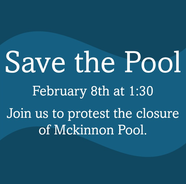
This week’s class is not my first attempt at graphic design. Exactly a week earlier I had been fighting Canva to create an infographic to advertise the “Save Mckinnon Pool Protest Walk” on Instagram. The graphic I made last week was too wordy so today I decided to use my newfound PowerPoint skills to try and make a new Instagram post. Something more punchy and straight to the point.
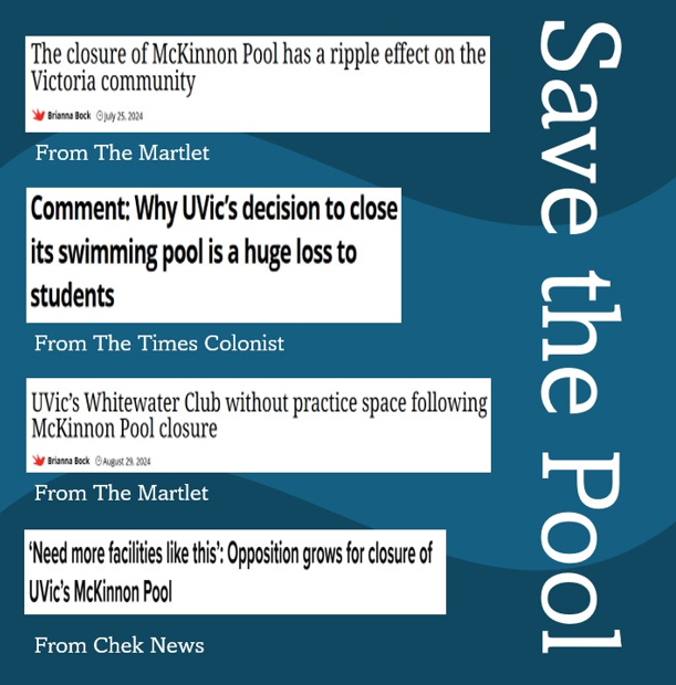
Ok yes, this one is also pretty wordy but I felt the article headlines legitimized the protest and made the issue feel more serious than the university shutting down a crummy 50-year-old pool. I figured maybe people who don’t know why Mckinnon pool could see this and resonate with at least one article clipping.
I have only been playing with PowerPoint for a day but I already feel I understand it much better. Do you see the wave pattern I added in the background? Now that’s graphic design!
Sorry, but comments are not enabled on this site.